Gestalt Theory of Organization
There are 7 individual principles commonly associated with gestalt theory:
similarity
continuation
closure
proximity
figure/ground
simplicity
common fate
Similarity
It’s human nature to group like things together. In gestalt, similar elements are visually grouped, regardless of their proximity to each other. They can be grouped by color, shape, or size. Similarity can be used to tie together elements that might not be right next to each other in a design.
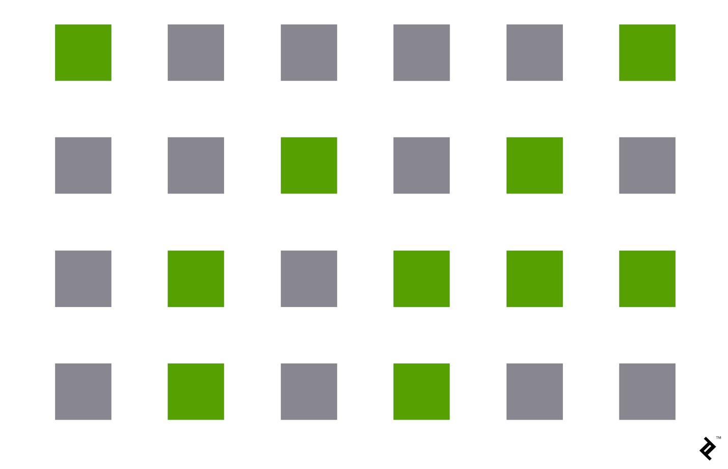 example of the gestalt principle of similarity
The squares here are all equally spaced and the same size, but we automatically group them by color, even though there’s no rhyme or reason to their placement.
Of course, you can make things dissimilar if you want to make them stand out from the crowd. It’s why buttons for calls to action are often designed in a different color than the rest of a page—so they stand out and draw the visitor’s attention to the desired action.
In UX design, using similarity makes it clear to your visitors which items are alike. For example, in a features list using repetitive design elements (such as an icon accompanied by 3-4 lines of text), the similarity principle would make it easy to scan through them. In contrast, changing the design elements for features you want to highlight makes them stand out and gives them more importance in the visitor’s perception.
Even things as simple as making sure that links throughout a design are formatted in the same way relies on the principle of similarity in the way your visitors will perceive the organization and structure of your site.
Continuation
The law of continuity posits that the human eye will follow the smoothest path when viewing lines, regardless of how the lines were actually drawn.
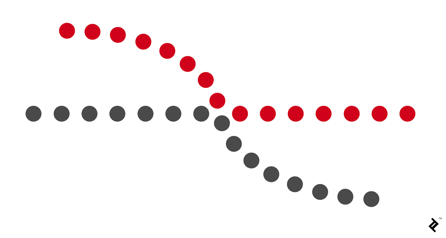 an example of the gestalt principle of continuity
The eye tends to want to follow the straight line from one end of this figure to the other, and the curved line from the top to the bottom, even when the lines change color midway through.
This continuation can be a valuable tool when the goal is to guide a visitor’s eye in a certain direction. They will follow the simplest path on the page, so make sure the most vital parts they should see fall within that path.
Since the eye naturally follows a line, placing items in a series in a line will naturally draw the eye from one item to the next. Horizontal sliders are one such example, as are related product listings on sites like Amazon.
Closure
Closure is one of the coolest gestalt principles and one I already touched on at the beginning of this piece. It’s the idea that your brain will fill in the missing parts of a design or image to create a whole.
In its simplest form, the principle of closure allows your eye to follow something like a dotted line to its end. But more complex applications are often seen in logos, like that for the World Wildlife Fund. Large chunks of the outline for the panda are missing, but your brain has no problem filling in the missing sections to see the whole animal.
 the logo for the world wildlife fund is an example of the gestalt principle of closure
The gestalt principle of closure is illustrated beautifully in the World Wildlife Fund’s panda logo. The brain completes the white shapes, even though they’re not well defined.
Closure is quite often used in logo design, with other examples including those for the USA Network, NBC, Sun Microsystems, and even Adobe.
Another very important example of closure at work in UX and UI design is when you show a partial image fading off the user’s screen in order to show them that there is more to be found if they swipe left or right. Without a partial image, i.e., if only full images are shown, the brain doesn’t immediately interpret that there might be more to be seen, and therefore your user is less likely to scroll (since closure is already apparent).
Proximity
Proximity refers to how close elements are to one another. The strongest proximity relationships are those between overlapping subjects, but just grouping objects into a single area can also have a strong proximity effect.
The opposite is also true, of course. By putting space between elements, you can add separation even when their other characteristics are the same.
Take this group of circles, for example:
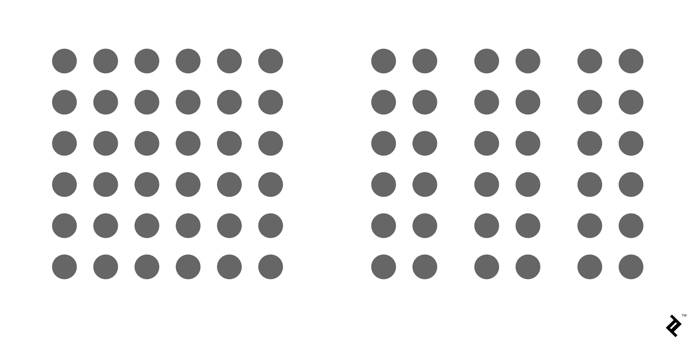 the gestalt principle of proximity illustrated with groups of circles
The only thing differentiating the group on the left from those on the right is the proximity of the lines. And yet your brain interprets the image on the right as three distinct groups.
 example of proximity gestalt principle in action impairing ux
A USPS PDF form example where the proximity gestalt principle is impairing UX. Due to the field labels being closer to the fields under them, people would mistakenly believe that’s where the information goes for “c.” and “d.” Yet, the information is supposed to be provided in the fields above the text labels.
In UX design, proximity is most often used in order to get users to group certain things together without the use of things like hard borders. By putting like things closer together, with space in between each group, the viewer will immediately pick up on the organization and structure you want them to perceive.
Figure/Ground
The figure/ground principle is similar to the closure principle in that it takes advantage of the way the brain processes negative space. You’ve probably seen examples of this principle floating around in memes on social media, or as part of logos (like the FedEx logo already mentioned).
Your brain will distinguish between the objects it considers to be in the foreground of an image (the figure, or focal point) and the background (the area on which the figures rest). Where things get interesting is when the foreground and background actually contain two distinct images, like this:
 an example of the figure-ground relationship forming elements and principles of design
Some people will immediately see the tree and birds when viewing the logo for the Pittsburgh Zoo & PPG Aquarium, while others will see the gorilla and lion staring at each other.
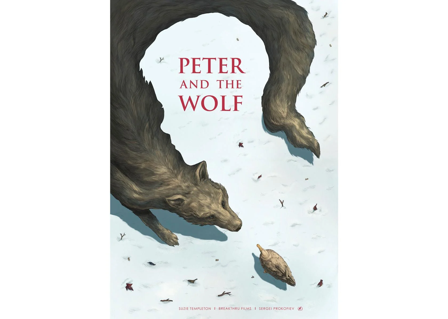 great example of the figure-ground gestalt principle
Another great example of the figure/ground gestalt principle.
A simpler example can be seen with this image, of two faces creating a candlestick or vase between them:
 a simple example of figure-ground principle, a gestalt design principle
In this famous illusion developed by Danish psychologist Edgar Rubin, the viewer is usually presented with two shape interpretations—two faces or a vase. It’s another excellent example of the figure/ground principle.
In general terms, your brain will interpret the larger area of an image as the ground and the smaller as the figure. As shown in the image above, though, you can see that lighter and darker colors can influence what is viewed as the figure and what is viewed as the ground.
The figure/ground principle can be very handy when product designers want to highlight a focal point, particularly when it is active or in use—for example, when a modal window pops up and the rest of the site fades into the background, or when a search bar is clicked on and the contrast is increased between it and the rest of the site.
Simplicity
The law of symmetry and order is also known as prägnanz, the German word for “good figure.” What this principle says is that your brain will perceive ambiguous shapes in as simple a manner as possible. For example, a monochrome version of the Olympic logo is seen as a series of overlapping circles rather than a collection of curved lines.
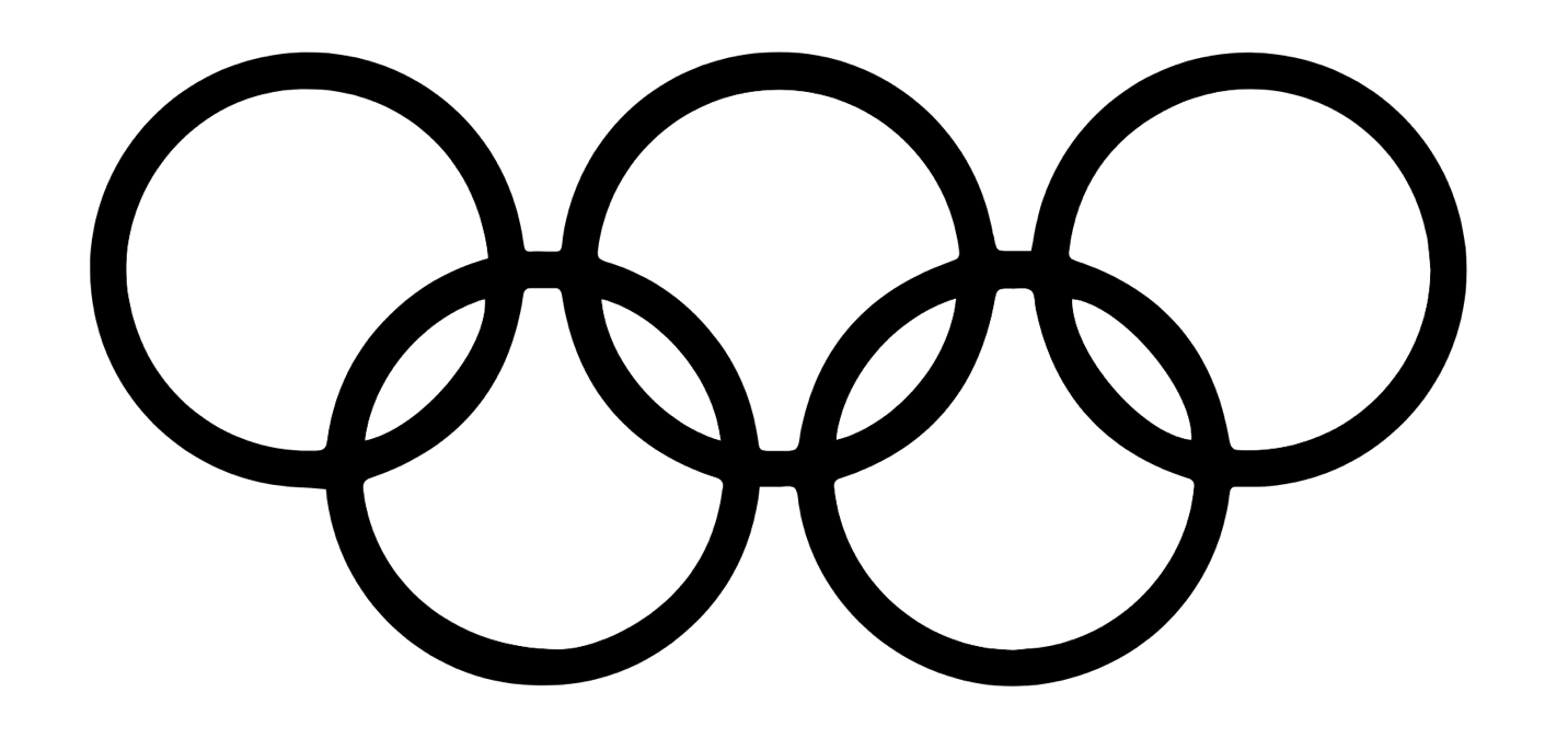 another one of the gestalt design principles, the principle of pragnanz is illustrated with the olympics logo
Here’s another good example of the gestalt design principle “prägnanz”:
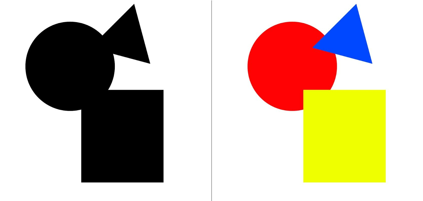 a complex example of the principle of pragnanz, another gestalt principle
Your brain will interpret the image on the left as a rectangle, circle, and triangle, even when the outlines of each are incomplete because those are simpler shapes than the overall image.
Common Fate
While common fate was not originally included in gestalt theory, it has since been added. In UX design, its usefulness can’t be overlooked. This principle states that people will group together things that point to or are moving in the same direction.
In nature, we see this in things like flocks of birds or schools of fish. They are made up of a bunch of individual elements, but because they move seemingly as one, our brains group them together and consider them a single stimulus.
 a flock of birds illustrates the principle of common fate
A flock of birds is viewed as a single unit when flying in the same direction and thereby sharing a common fate. (by Martin Adams on Unsplash)
This is very useful in UX as animated effects become more prevalent in modern design. Note that elements don’t actually have to be moving in order to benefit from this principle, but they do have to give the impression of motion.
Gestalt Principles in UX Design
As with any psychological principle, learning to incorporate the visual perception principles of gestalt into your design work can greatly improve the user experience. Understanding how the human brain works and then exploiting a person’s natural tendencies creates a more seamless interaction that makes a user feel comfortable on a website, even if it’s their first visit.
Gestalt principles are relatively easy to incorporate into just about any design and can quickly elevate a design that seems haphazard or like it’s fighting for a user’s attention to one that offers a seamless, natural interaction that guides users toward the action you want them to take.