 Matt Cram
Figma’s New UI
Note: since posting this, many/most of my concerns have been addressed or have fallen away as I begin to see the value of the updated UI. Maybe delete this post??
I am just going to say it: I’m worried about @Figma’s new UI. I love the work and the obvious care that went into it but UI3 has a huge impact on my relationship to Figma. By boxing every parameter and rounding all the corners, they are losing some of their elegance while increasing the visual complexity making the space look even busier than before.
Affording complexity
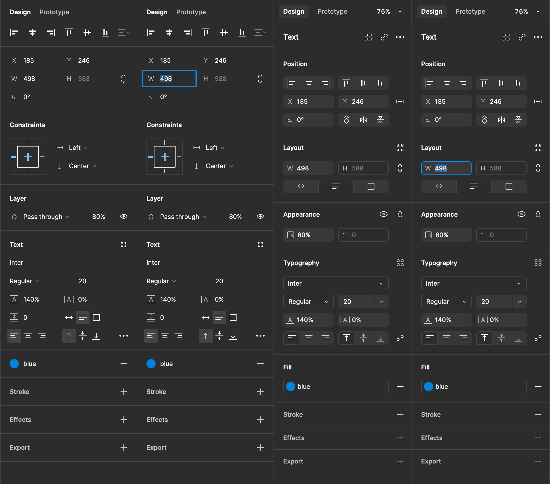
Each of the newly boxed parameters introduces 4 corners, 4 edges, 4 spaces of padding, 4 spaces of margin, and more. All of it unnecessary as proven by their previous, and incredibly elegant, UI.
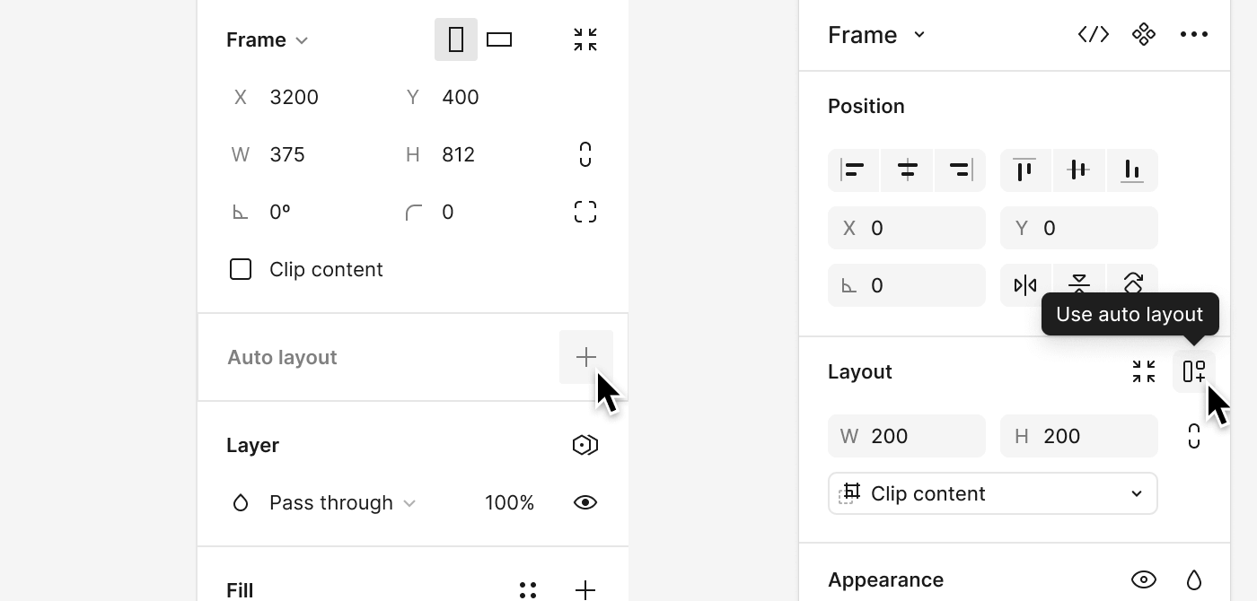
All of these little boxes were added to improve affordance for the parameters, to let the user know it can be manipulated. I feel this is useful in a situation where some things can be manipulated and others cannot but that is not the case in a context aware control panel. Except for the section headings, everything visible can be interacted with in both designs.
The affordance boxes introduce new questions too, like what gets a box and what doesn’t. In the image above, the buttons for flip and rotate get the box while buttons for resize to fit, use autolayout, and constrain proportions do not. I can guess at the reasoning behind this but do some things not need the little box? When do they not? Why do other things need it?
When I look at the properties palette in UI3, it looks to me like some options are highlighted and others are not. I don’t feel like it is prioritization however as I rarely need to rotate by 90° and often add autolayout (though usually with the shortcut) or change blending mode.
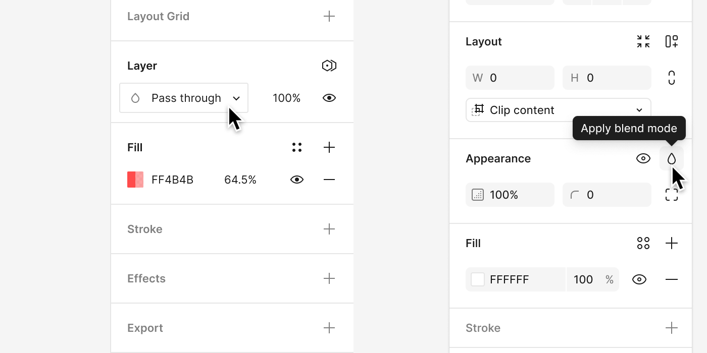
Even the drop shadow added to the palette increases complexity. UI2’s single line effectively delineates the space while the shadow of UI3 introduces depth, an increase of visual information.
What really makes my brain itch is the gap created between the UI and edge of the app window with the artboard peeking through. As the palettes are the same width, that space has been taken from the workspace seemingly for decoration. This is a true loss, especially on a laptop.
Organization
I am also concerned with the way the tools are organized. This may change for me as I find my new workflow but it does seem like there may be some losses. For example, the current layer’s blend mode will now be concealed behind a menu.
Note: I know there are humans behind these changes… intelligent, meaningful humans with human feelings. To those folks, please know that I too care very much about Figma’s UI and I only share these observations in the spirit of that care.
Clipping vs Showing
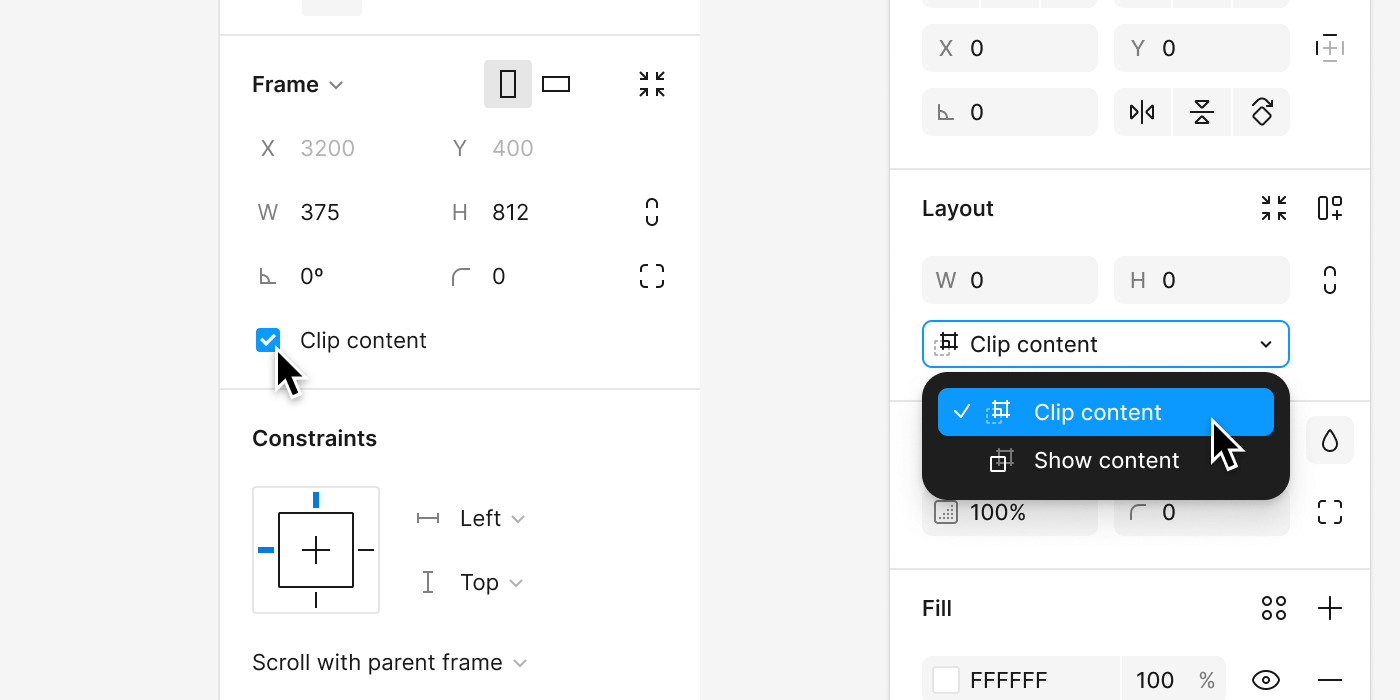
Clip content is a checkbox parameter in the current UI (UI2?) but is now a select box in UI3. This introduces an oddity and is maybe a good case for using a checkbox over a select. They aren’t the same. The checkbox is either on or off while you are choosing between options with a select box. This could be on or off but Figma has chosen “Clip content” and “Show content.” Strange, don’t we show the content either way. What we are really clipping or showing is the overflow content. The checkbox felt a little more clear. Also I feel like a select box takes more energy to manipulate than a checkbox.
Constaints
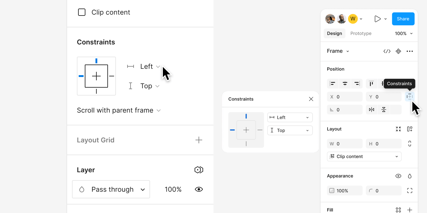
Another added complexity is that the controls for constraints seems to have moved to a popup box. I use the constraint parameters a lot and it is disappointing to see them buried a layer deeper.
Still…
I am still learning what the new UI really means and all of this is just my gut response. Most people don’t like change, especially to something they already love. And let me tell you, I love Figma. I spend most of the day working in it and a fair portion of my free time in it just messing around. I recommend Figma to just about anyone who will listen and have converted many to new Figma users.
The minimal and elegant interface is one of the things I like most about Figma. The Adobe and Affinity apps feel like information overload compared to Figma’s tools, and don’t even get me started on Microsoft. I enjoy how light it feels and yet it is so capable.
I am sure there will be some things I will love about the new UI3. For now, it seems like a step backwards. It looks like Sketch or Lunacy and I really think it shouldn’t. Will I stick with Figma? Of course I will! I will just miss the simpler days without all the boxes.
Let’s make a list
More boxes than one can afford
- Too many parameter affordance boxes clutter the interface. These seem unnecessary compared to the elegance of UI2. It’s simplicity was direct and honest. If it was on the panel, it could be manipulated.
- Each affordance box adds complexity: multiple corners, edges, padding, and margins. Rounded corners of parameter boxes create unnecessary focal points between the boxes.
- Inconsistency in which elements receive parameter boxes (e.g., flip and rotate buttons have boxes, while resize to fit and autolayout buttons do not).
Space and layout
- Properties panel takes up more space and feels crowded despite burying information that was top level in UI2
Usability and mavigation
- Affordance boxes are inconsistent and create confusion about their necessity.
- Misaligned prioritization in the properties palette (e.g., rotate by 90° option is prominent, autolayout and blending mode are not).
- Floating palettes cannot be docked, resulting in lost workspace.
- Floating palettes with soft, shadowed edges feel crowded and less aesthetically pleasing.
- Scrollbars between palette and window edge look like visual glitches.
- Gap between UI and app window edge reduces usable workspace, particularly on laptops.
Organization
- Constraints are no longer top-level, making them less accessible.
- Separation of width (W) and height (H) from position (X) and (Y) is confusing.
- Width of boxes during autolayout adjustments is revealed on rollover or palette expand, which is suboptimal.
- Misplacement of controls like “clip content” and “show content”; these should be under appearance, not layout.
- Blend mode is harder to access compared to UI2, reducing functionality.
- Auto height and auto width for textboxes are categorized under layout instead of typography.
- Parameter for spacing between elements is in the layout panel but might fit better in the position panel.
- Important context buttons (e.g., make component, mask) are buried and need to be resurfaced.
Visuals
- UI3 introduces unnecessary visual complexity compared to the elegant simplicity of UI2.
- Align buttons use two colors, making them harder to read, especially on center buttons.
- The four dot styles menu icon is heavier than other icons and should probably match the three-dot more menu.
- Reduced space for avatars of collaborators.
- Less usable space in the layers panel; layers could be spaced more efficiently.
General concerns
- Single line delineation in UI2 was more effective than the drop shadow in UI3. Drop shadow adds another layer of information about the panel increasing visual complexity.
- Gap between UI and app window edge with artboard peeking through reduces workspace.